Your Waste Analytics Dashboard Is Only as Honest as Its Worst Sensor
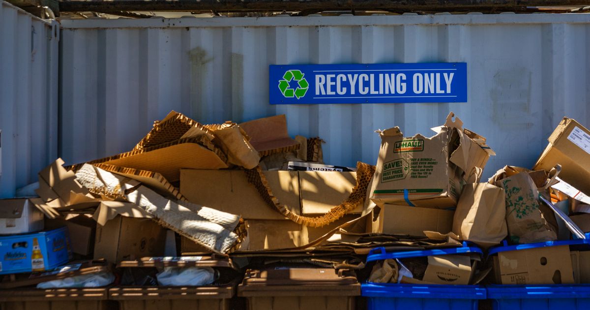
Walk onto the mezzanine at a big-city materials recovery facility and there's a screen bolted to the wall now, where five years ago there was a whiteboard. Recovery rate by stream. Throughput against nameplate. Contamination creeping up the optical-sorter reject line. Downtime on the number-three eddy current. It refreshes every couple of seconds, and the plant manager checks it the way you'd check a speedometer. That live screen is what real-time waste analytics is supposed to buy you: the operation as a number you can act on this shift, not a spreadsheet you reconcile at month-end.
I build those systems, the sensor stacks and the pipelines that feed them. So let me say the unglamorous part first. The screen is maybe ten percent of the job. The other ninety is the plumbing underneath that decides whether the number on it is true, and almost nobody budgets for that ninety. A waste analytics dashboard is only ever as honest as its worst-calibrated sensor, and sensors drift. Always. That isn't a maintenance footnote, it's the whole engineering problem.
This is a walk through how one of these systems works, from the number on the wall back down to the photodiode that generated it. And where it tends to come apart, because I've watched that happen.
Start With What the Screen Is Supposed to Tell You
Forget the technology for a second and look at the output, because that's what you're actually paying for. A useful waste operations analytics setup tracks a short list, and most plants want the same short list: throughput against design rate, recovery rate per material stream (PET, HDPE, fiber, aluminum, steel), contamination on the infeed and in each product bale, equipment availability and downtime by machine, and, if there's a collection fleet upstream, fill-level and route metrics off the bins. That's the spine of any real-time waste data system, whether the vendor sells it as BI, waste intelligence, or just "the analytics module."
Here's why the live part earns its keep and isn't just a buzzword. Residue content on a typical MRF infeed swings from 10 percent to as much as 55 percent depending on the load, per Greyparrot's published MRF analytics. If your composition figure is a weekly grab sample, you're steering a process that changes by the truckload with a number that updates by the week. Stabilizing throughput against live composition is where one large MRF found an 18 percent lift in material recovery (and that only holds once throughput is genuinely stable, which is the hard part). The number being current is the entire point.
Layer One: Where the Numbers Are Born
Every figure on that screen starts as a physical measurement, and the measurement quality sets the ceiling for everything downstream. You can't analytics your way out of a bad sensor. (You can hide one for a while, which is worse.)
On the sorting line, the workhorses are optical: near-infrared spectrometers reading polymer type across the belt, plus RGB cameras and, now, hyperspectral ones running computer-vision inference. A modern vision classifier on a waste line runs at 15 to 30 frames per second and will tag a hundred-plus material categories. Greyparrot's analyzer, to take a published spec, tracks 111-plus waste types at 98 percent accuracy. That's the marketing-true number. The operational number depends entirely on whether your belt speed, lighting, and lens stay inside the envelope the model trained on. Precision is easy; recall is where the model lies to you, and recall is the first thing to go when conditions slip.
If you also run collection, the upstream data comes off a different stack: ultrasonic fill-level sensors in the bins reporting over low-power radio (Sigfox, NB-IoT, LoRaWAN, pick your flavor) a few times a day, plus GPS and engine telematics from the trucks. CARTO's writeup of one smart-collection rollout describes exactly this, ultrasound fill sensors feeding a dashboard that predicts fullness and redraws routes for fewer kilometers per kilogram collected. Different sensors, same principle: the dashboard sits downstream of physics.
And weight. Weighbridge and in-line load cells anchor the whole mass balance, because every recovery-rate and diversion claim reduces, in the end, to tonnes in versus tonnes out. Get the weighing wrong and every percentage stacked above it is fiction, no matter how clean the chart looks.
Layer Two: The Pipeline Nobody Budgets For
So you've got NIR, cameras, fill sensors, load cells, and telematics all firing, and none of them agree. The NIR calls a belt section 35 percent organics; the camera calls the same section construction debris; the moisture probe reads a value the load-cell density says is impossible. Raw, these feeds are noisy and contradictory. The pipeline that reconciles them into one trustworthy number is the actual product, and it's the first thing value-engineered out of a budget.
What does that pipeline do? It time-aligns feeds that arrive at different rates (a 25 FPS camera and a once-a-day fill sensor don't share a clock). It weights each sensor by how well it's been tracking ground truth lately. It carries a confidence interval on every estimate, so a 92 percent recovery reading arrives stamped "plus or minus four," not as gospel. And it watches itself for drift, because drift isn't an if.
Most projects go wrong right here, and in a boring way: they ship the dashboard and skip the data-quality layer. The screen looks great in the demo. Six months in, the numbers have quietly decoupled from reality, and nobody notices until a bale gets rejected at the buyer's gate. Before you trust any number on a waste BI dashboard, somebody on site has to be able to answer these:
- When was each sensor last calibrated, and against what reference?
- Is the model's training distribution still the distribution coming down the belt? (New supplier, new packaging, seasonal swing - all of it shifts the input.)
- Does the sample rate actually cover the belt at line speed, or are you reading every third tote?
- Does every displayed figure carry a confidence interval, or just a decimal point that implies one?
- What's the ground truth, and how often does the system reconcile against it?
Skip those and you don't have analytics. You have an expensive screensaver that happens to show plausible numbers.
I'll give you the most expensive lesson I own on this. In 2023 I lost the better part of six months to a precision drop I was sure was a model fault. Recall on a clean stream cratered every morning and recovered by mid-shift. So why did it keep cratering? I retrained, reweighted, relabeled, the whole ritual. The model was fine. It was condensate. A poorly sealed gasket on the camera enclosure was letting the lens fog during cold starts, and the vision model was faithfully classifying a blurred image. The dashboard never lied, it reported exactly what the camera saw. The camera was the problem, and no amount of analytics fixes a hardware fault upstream of the photons. Six months, chasing a gasket.
That's the lesson under all of this. Sensor drift always wins eventually, and the data layer is where the whole dashboard quietly starts lying. Most of what gets sold as AI in waste management is a rule-based pipeline with a CNN bolted on and nothing watching for drift behind it, which works fine right up until the input shifts and there's no one home.
Layer Three: From a Number to a Decision
A number you only look at is overhead. The point of real-time waste data is to close a loop with it, and there are three loops worth building.
The fast loop is process control on the sorting line: when live composition shifts, air-jet timing and belt speed adjust to hold recovery, and the same compositional feed runs the waste intelligence software that drives thermal conversion downstream. That's the sibling to this system, same sensors, a different consumer of the data.
Maintenance is the medium loop. Vibration and current signatures off the motors feed a model that flags a bearing before it seizes. Telematics-driven predictive maintenance can cut unplanned downtime hard, one Florida hauler reported a 40 percent drop [industry case data]. Done honestly, though, I'd tell you to halve whatever ROI a vendor quotes for the first eighteen months. That's roughly how long it takes to work the labeling drift out of the failure data, because early on the model throws false alarms faster than the technicians will tolerate and they stop trusting it. We hit exactly that on a Hitachi Zosen line in 2024, eleven false positives before we caught that the training labels themselves had drifted.
Then the slow loop: the collection fleet and the route. Live fill data means you stop sending trucks to half-empty bins, which is where the headline route-optimization savings come from. And here's the engineer's caveat the brochures skip, most of the time the fix isn't a smarter model at all. It's a calibration. Reseat the sensor, retune the threshold, fix the clock skew. The answer is usually the PID, not the network.
What It Costs, and Where It Doesn't Pay
The number people actually ask me for is the value case, and it's easiest to see against manual sampling. Greyparrot put the contrast at 375 hours and roughly £4,300 to hand-sample thirty PET bales the old way (call it £140 a bale), versus six hours and £17 of analyzer time for the same picture. When a single misconfigured machine can quietly bleed £240,000 a year in lost recovery, the analytics layer pays for itself on one caught fault.
But it doesn't pay everywhere, and I'd rather say so up front. Below roughly 100 tonnes a day, the sensor and integration capital is hard to justify against a stream that barely varies, a single-source commercial load on a forgiving line doesn't need real-time composition because the composition hardly moves. Wet feedstock wrecks optical accuracy: on a 600 TPD retrofit I ran in 2022, a Tomra autosort that held 94 percent recall on PET dropped to 71 percent the moment infeed moisture spiked past 18 percent (we anonymize the site, not the number, and it came back when the stream dried out). And if there's no downstream actor who can change behavior on the strength of the number, no operator allowed to retune, no buyer who'll pay for cleaner bales, then the dashboard is decoration with a refresh rate.
This is the part the AI waste management software category undersells, because "your data layer needs constant care" is a worse pitch than "real-time insight at your fingertips." The operators getting audit-ready numbers out of these systems, the ones whose diversion and recovery reporting survives someone checking it against Directive 2008/98/EC, are the ones who treated the pipeline as the product and the dashboard as the easy part.
The same discipline runs through any honest zero-waste-to-landfill solutions claim and through ESG-compliant projects generally: a diversion percentage is only ever as good as the mass balance sitting under it. Auditors have started reading the supporting data, not just the headline figure, and the supporting data is what the pipeline either earns or fakes.
So if you're scoping a real-time waste analytics build, spend your first dollar on the boring layer. Ask who owns calibration, what the drift-detection plan is, and how the thing reconciles against ground truth, all of that before you've sat through a single demo. The dashboard will be fine. It's the gasket that'll get you.
Disclosure: I design sensor and analytics systems for waste operations. Optimal Waste Intelligence, referenced above, is the waste-intelligence platform built by Renewable Waste Energy, which publishes this column. Figures attributed to my own work come from commissioning data on installations I've worked, with sites anonymized.
Sources & Notes
- The MRF composition and recovery figures (residue swinging 10 to 55 percent, the 18 percent recovery lift from stabilized throughput, 111-plus material types at 98 percent accuracy, and the manual-versus-analyzer sampling costs) all come from Greyparrot's MRF analytics case data.
- The collection-side stack (ultrasonic fill sensors, low-power radio, route redrawing for fewer kilometers per kilogram) is laid out in CARTO's account of a Dedalo Cities deployment.
- The 40 percent unplanned-downtime figure is a telematics result reported for a single Florida hauler in industry coverage of fleet predictive maintenance; read it as one operator's outcome, not a sector average.
- The 2022 Tomra recall numbers, the 2023 condensate fault, and the 2024 Hitachi Zosen false-positive count are mine, from commissioning work on installations I anonymize but don't fictionalize.
Researched and written by OWI editorial staff. Technical review by RWE engineering. AI tools used for drafting assistance.